Examining how adjusted offensive and defensive efficiency, power rating, and shooting metrics relate to postseason performance across eleven NCAA Tournament seasons (2013–2024).
College basketball analytics has increasingly shifted from traditional statistics (win-loss records, raw scoring margins, etc.) toward advanced efficiency-based metrics that more accurately reflect team quality and predict competitive outcomes. This project analyzes NCAA Division I basketball team performance using a dataset compiled from Kaggle and originally sourced from analyst Bart Torvik's analytics database, which adjusts for opponent strength and game tempo.
The central question is: do advanced metrics like adjusted offensive efficiency, adjusted defensive efficiency, power rating (BARTHAG), and shooting efficiency meaningfully predict postseason success in the NCAA Tournament? This matters because modern program evaluation, bracketology, and strategic decision-making increasingly depend on deeper analytics. College basketball also offers a rich analytical environment: over 350 Division I teams, significant tactical diversity across conferences, and a high-variance single-elimination postseason that makes identifying true team quality difficult with surface-level statistics alone.
The five visualizations below follow a deliberate narrative arc. We begin with a conference-level overview of power ratings to establish the landscape (Viz 1). We then examine multi-metric performance profiles across all postseason groups, comparing how teams at different tournament depths look across both offensive and defensive dimensions (Viz 2). From there, we test which efficiency metrics, both offensive and defensive, correlate most strongly with schedule-adjusted wins, and add one shooting metric for comparison (Viz 3). We then plot the full two-dimensional efficiency space interactively, colored by postseason outcome, to see whether teams cluster meaningfully by result (Viz 4). Finally, we formalize that relationship by binning teams into efficiency tiers and examining what fraction of each tier reaches each round (Viz 5).
The dataset is the College Basketball Dataset from Kaggle (uploaded by Andrew Sundberg), which compiles advanced NCAA Division I statistics originally scraped from Bart Torvik's analytics website. It covers the 2013–2019 and 2021–2024 seasons (the 2020 tournament was canceled due to COVID-19), contains 3,885 rows and 24 columns, where each row represents one team in one season. No imputation was required; non-tournament teams have a blank postseason field, treated throughout as a distinct "No Tournament" category.
The color encoding below is consistent across the visualizations:
Investigates mathematical upset probabilities based on tournament seeding. Because our dataset includes both seed and postseason round, this paper provides a benchmark for evaluating whether advanced efficiency metrics outperform committee-assigned seeding as a predictor of tournament success.
bracketodds.cs.illinois.edu →Introduces efficiency-based evaluation methods (adjusted points per possession normalized for opponent strength) that directly underpin ADJOE and ADJDE. This work established the theoretical foundation for modern college basketball analytics and informs how we interpret the efficiency scatter in Visualization 4.
kenpom.com →Before examining whether advanced metrics predict individual team success, it is useful to understand how power ratings are distributed at the conference level. BARTHAG, the probability that a team would defeat an average Division I opponent on a neutral court, provides a single composite measure of overall team strength. The box plot below shows the spread of BARTHAG across seven major conferences, ordered by median, across all team-seasons from 2013 to 2024.
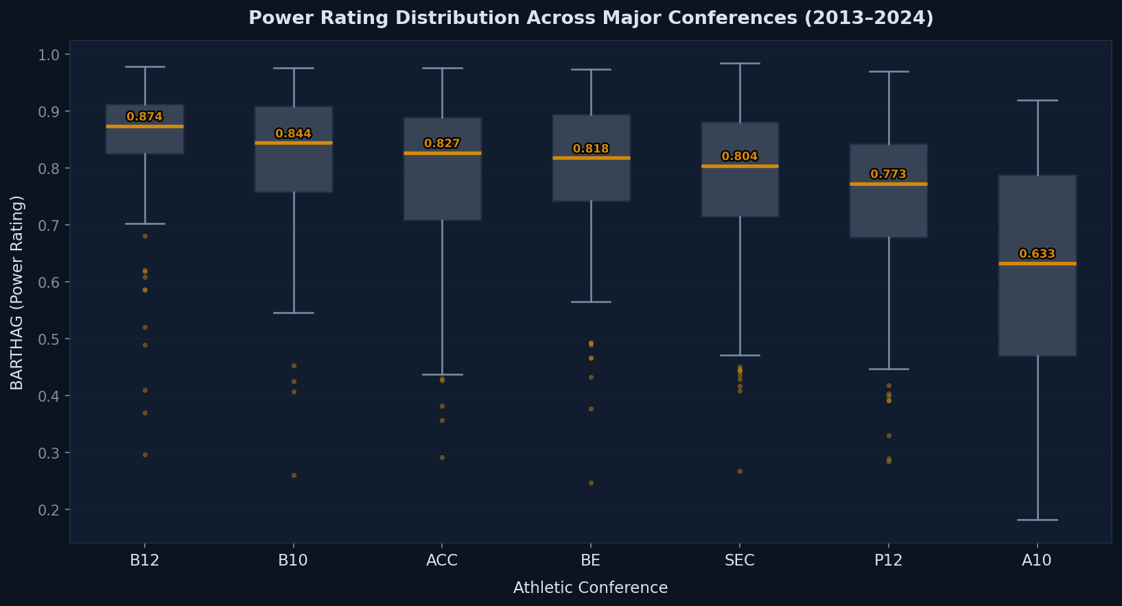
The Big Ten and Big 12 consistently produce the highest median BARTHAG values, followed closely by the ACC and SEC. The Atlantic 10 shows substantially lower median power ratings, reflecting the gap between power-conference and mid-major programs even among conferences considered "major." Critically, every conference exhibits wide internal variance: the top quartile of ACC or SEC teams can match or exceed the median of any other conference, while the bottom quartile pulls the distribution down considerably. This within-conference variance is what makes BARTHAG a more informative metric than conference membership alone when predicting tournament outcomes.
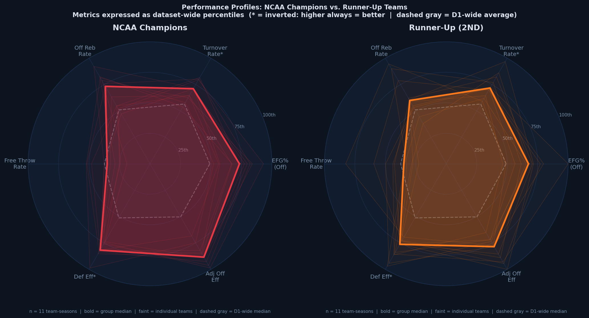
If advanced metrics capture what makes a team elite, we should expect teams at different tournament depths to show distinctly different profiles across multiple dimensions. The radar charts below display six key metrics expressed as dataset-wide percentiles: effective field goal percentage, turnover rate, offensive rebound rate, free throw rate, adjusted defensive efficiency, and adjusted offensive efficiency. Metrics where a lower raw value is better (turnover rate, defensive efficiency) are inverted so that higher on every axis always means better performance. The bold polygon shows the group median. The gray dashed polygon shows the full D1-wide median, so you can immediately see how far above or below average each group sits.
Use the buttons below to switch between postseason groups. Compare any group against the D1-wide baseline (gray dashed) and observe how the profile shape changes as you move from non-tournament teams through to champions. The overview tab shows champions and runners-up side by side for direct comparison.
As you step through the groups from Champions down to No Tournament, the median polygon steadily contracts toward and below the gray D1-wide baseline. Champions and runners-up share broadly similar profiles (both well above average on every metric) but champions show higher medians on adjusted offensive efficiency and defensive efficiency, and less spread among individual teams. Non-tournament teams cluster at or below the baseline on every axis. The most diagnostically useful comparison is defensive efficiency: the gap between Final Four teams and Elite Eight teams on that single axis is larger than the gap on any offensive metric, suggesting elite defense is the hardest capability to replicate and the strongest differentiator among the very best programs.
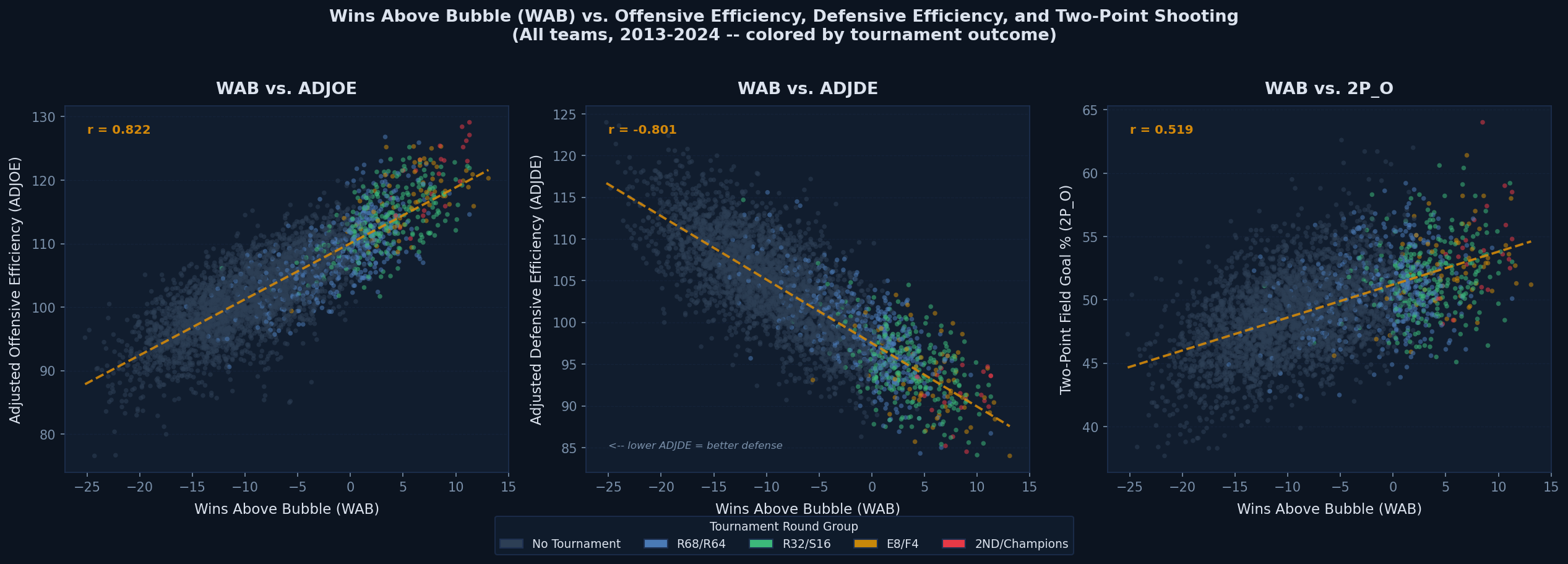
Wins Above Bubble (WAB) measures how many more wins a team accumulated than a hypothetical bubble team would have on the same schedule (a schedule-adjusted indicator of how definitively a team established its tournament worthiness). The three scatter plots below compare WAB against adjusted offensive efficiency, adjusted defensive efficiency, and two-point field goal percentage. Showing both efficiency metrics in the first two panels sets up the two-axis efficiency space used in Visualization 4; the third panel narrows to one shooting metric to test whether interior shooting quality carries additional explanatory power. Points are colored by grouped tournament outcome (using the shared color scheme defined in the data section), and each panel includes an OLS trend line with the Pearson correlation coefficient.
Adjusted offensive efficiency (ADJOE) has the strongest positive correlation with WAB of the three metrics shown. Adjusted defensive efficiency (ADJDE) shows a notable negative correlation: lower ADJDE means better defense and is associated with more wins above the bubble, confirming that both dimensions of efficiency matter for schedule-adjusted win accumulation, not just offense. Two-point percentage shows a positive but substantially weaker correlation, indicating that shooting accuracy in the paint is relevant but secondary to overall efficiency ratings. Across all three panels, teams reaching the Elite Eight or beyond (amber through red) concentrate in the favorable region of each plot, while non-tournament teams dominate the unfavorable region, reinforcing that WAB and advanced efficiency metrics jointly discriminate between tournament-caliber and below-average programs.
Plotting adjusted offensive efficiency (ADJOE) on the horizontal axis against adjusted defensive efficiency (ADJDE) on the vertical axis (with the vertical axis inverted so that "up" always means better defense) creates a two-dimensional efficiency space. The upper-right quadrant contains teams with elite offense and elite defense; these are the programs most likely to make deep tournament runs. Point size encodes BARTHAG, so the largest circles represent the highest overall power ratings. Color encodes postseason round using the shared scheme from the data section.
How to use this chart: Uncheck Show all seasons and then drag the Season slider to step through individual years to see changes over time. Note that 2020 has no data (tournament canceled). Click any round label in the legend to isolate teams that reached that round; click again to reset. Hover over any point for full team details.
Championship and Final Four teams occupy a clearly defined upper-right region of efficiency space (high ADJOE combined with low ADJDE) and this separation becomes visually obvious when the legend is used to isolate deep tournament runs. Non-tournament teams scatter broadly and dominate the lower-left quadrant. Using the season slider reveals year-to-year variation: some seasons produce a denser cluster of elite teams (e.g., 2015, 2019) while others are more diffuse, which in part explains bracket unpredictability. The two-dimensional efficiency position is a stronger visual separator of postseason outcomes than either metric would be in isolation, which directly motivates the tier analysis in Visualization 5.
The preceding visualizations establish that elite teams look different in efficiency space. This chart formalizes that relationship: do teams with stronger advanced metrics actually reach deeper tournament rounds at meaningfully higher rates?
All 3,885 team-seasons are sorted by the selected efficiency metric and divided into five equal-count groups called quintile tiers: each containing approximately 777 teams. Tier 1 is always the weakest quintile and Tier 5 is always the strongest, regardless of which metric is selected. Because lower ADJDE indicates better defense, the tier labels for ADJDE are reversed during assignment so that Tier 5 still means "top 20% by defensive efficiency." The bars then show what percentage of teams within each tier reached each postseason round. So if advanced metrics are genuinely predictive, we expect Tier 5 to be heavily weighted toward tournament participants and deep runs, while Tier 1 should be almost entirely non-tournament programs.
How to use this chart: Use the Tier metric dropdown to switch between BARTHAG, offensive efficiency (ADJOE), and defensive efficiency (ADJDE) quintile tiers. Hover over any colored bar segment to see the exact count and percentage for that round within that tier. Click any segment to highlight that postseason round across all five tiers simultaneously; click the same segment again to deselect.
The gradient is unambiguous across all three metric choices. Tier 5 teams, the top 20% by any efficiency metric, account for nearly all participants in the deepest tournament rounds, while Tier 1 and Tier 2 teams are almost exclusively non-tournament programs. Switching the metric reveals subtle but meaningful differences: BARTHAG produces the sharpest tier separation overall, consistent with its role as a composite power rating. Comparing ADJDE against ADJOE shows that defensive efficiency produces a slightly steeper gradient at the top tiers; a larger share of Tier 5 ADJDE teams reach the Final Four and beyond than the equivalent ADJOE tier, reinforcing the conclusion from Visualization 2 that elite defense is the more reliable discriminator of championship-level outcomes. Together, these patterns confirm that advanced efficiency metrics are systematically predictive of postseason depth, not merely correlated with it.
Across five visualizations, a consistent and analytically coherent picture emerges. Advanced efficiency metrics, particularly the composite power rating BARTHAG and adjusted defensive efficiency ADJDE, are strong systematic predictors of NCAA Tournament depth.
Both the radar profiles in Viz 2 and the tier distributions in Viz 5 show that ADJDE produces sharper stratification at the deepest tournament rounds than ADJOE does. The gap between Final Four teams and Elite Eight teams is wider on the defensive axis than on any offensive metric. Programs building toward a championship run should weight defensive investment heavily, as elite offense is more common among near-elite teams than elite defense is.
The WAB scatter in Viz 3 demonstrates that two-point percentage has a noticeably weaker and noisier relationship with schedule-adjusted wins than adjusted offensive efficiency does. Three-point percentage (not shown in Viz 3 but explored in preliminary analysis) is even noisier. Recruiting strategies and in-season adjustments that prioritize system-level efficiency, captured by ADJOE, over raw shooting percentages are better aligned with what actually predicts postseason success.
Tier 5 BARTHAG teams reach the Sweet 16 or further at dramatically higher rates than committee seeding alone would predict for mid-major programs with equivalent records. Future work could build a logistic regression or gradient-boosted model using ADJOE, ADJDE, and BARTHAG to generate head-to-head win probabilities, testing whether efficiency-first brackets outperform seed-bracket baselines across the eleven seasons in this dataset.
Several extensions would strengthen these findings. First, incorporating game-level data rather than season averages would allow analysis of whether teams that peak late (improving ADJOE/ADJDE during conference tournament play) outperform their season-average tier in the NCAA Tournament. Second, conference-level adjustment (comparing a team's metrics within their own conference rather than across all 350+ programs) could improve predictions for mid-major programs that dominate weak conferences. Third, player-level efficiency metrics (usage rate, true shooting percentage) would allow examination of whether individual star quality provides tournament upside beyond what team-level metrics capture.